Lilypad
UX Design
Overview
A collaboration tool that supports data-based decision-making about interventions for children with special needs.
Each Lilypad helps a behavioral specialist record data in the moment, while working with a child who has special needs. Together, the system of Lilypads enables sharing and analysis of the data that has not been possible before. The Lilypad system was designed together with real behavioral specialists who wanted a better way to record and analyze data.
Goal
The goal of Lilypad is to provide a platform that facilitates data collection, analysis and discussion between teachers, therapists and supervisors.
Team
The Lilypad team consists of designers, developers and researchers.
Team members: Quintin Carlson, Hayden Demerson, Ryhan Hassan, Westin Lohne, Gabriela Marcu, Greg Nicholas, Chanamon Ratanalert, Kevin Schaefer, Cristina Shin
Role
I worked as an UX Designer on the undergraduate research team led by Gabriela Marcu, a PhD candidate at Carnegie Mellon University. As an UX Designer, I worked closely with the other two designers on the team while maintaining close communication with the developers to address design issues as rapidly as possible. I also designed and prototyped early mockups and research methods for preliminary user testing using Axure RP.
Research
Before diving into designing Lilypad, I visited the school we were working with to observe how things are run. I quickly realized that the teachers who would be using Lilypad had to juggle far more than teachers in most schools. It became even more important that the design be as simple and intuitive as possible, because they would be using this in the brief moments of free time they had throughout the day.
My first responsibility working on Lilypad was to figure out a way to quickly prototype the Collect screen for a think aloud study. Over two weeks I worked with the other designers and researchers to build a prototype that would facilitate the think aloud study.
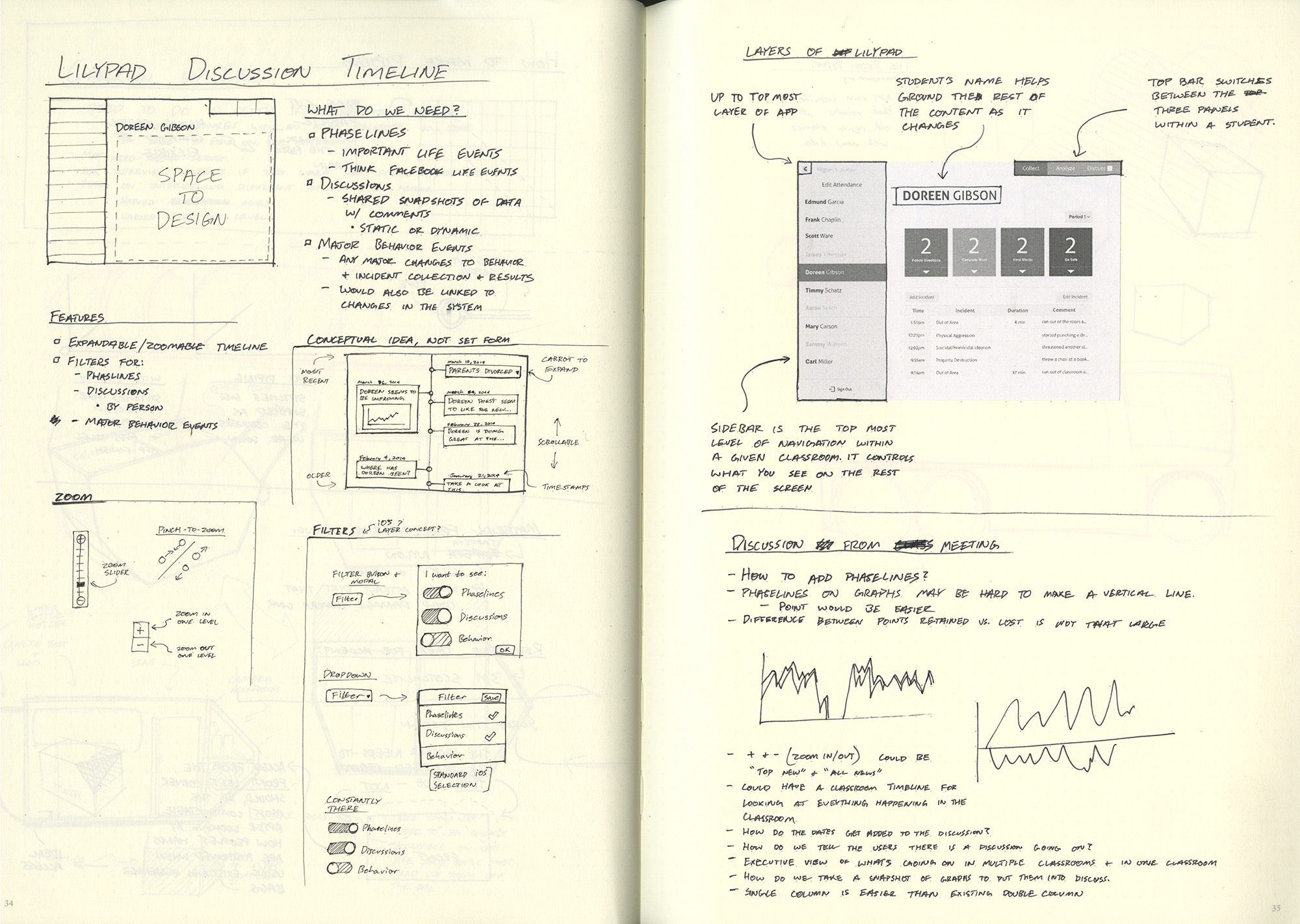
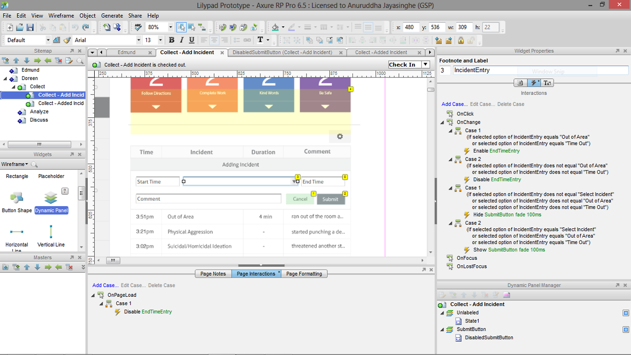
App Design
Treatment Period Report
I've worked on numerous aspects of this project, so I've shown a selection of my favorite work I've done below.
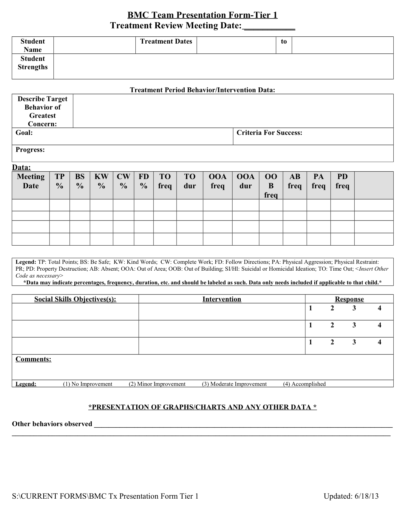
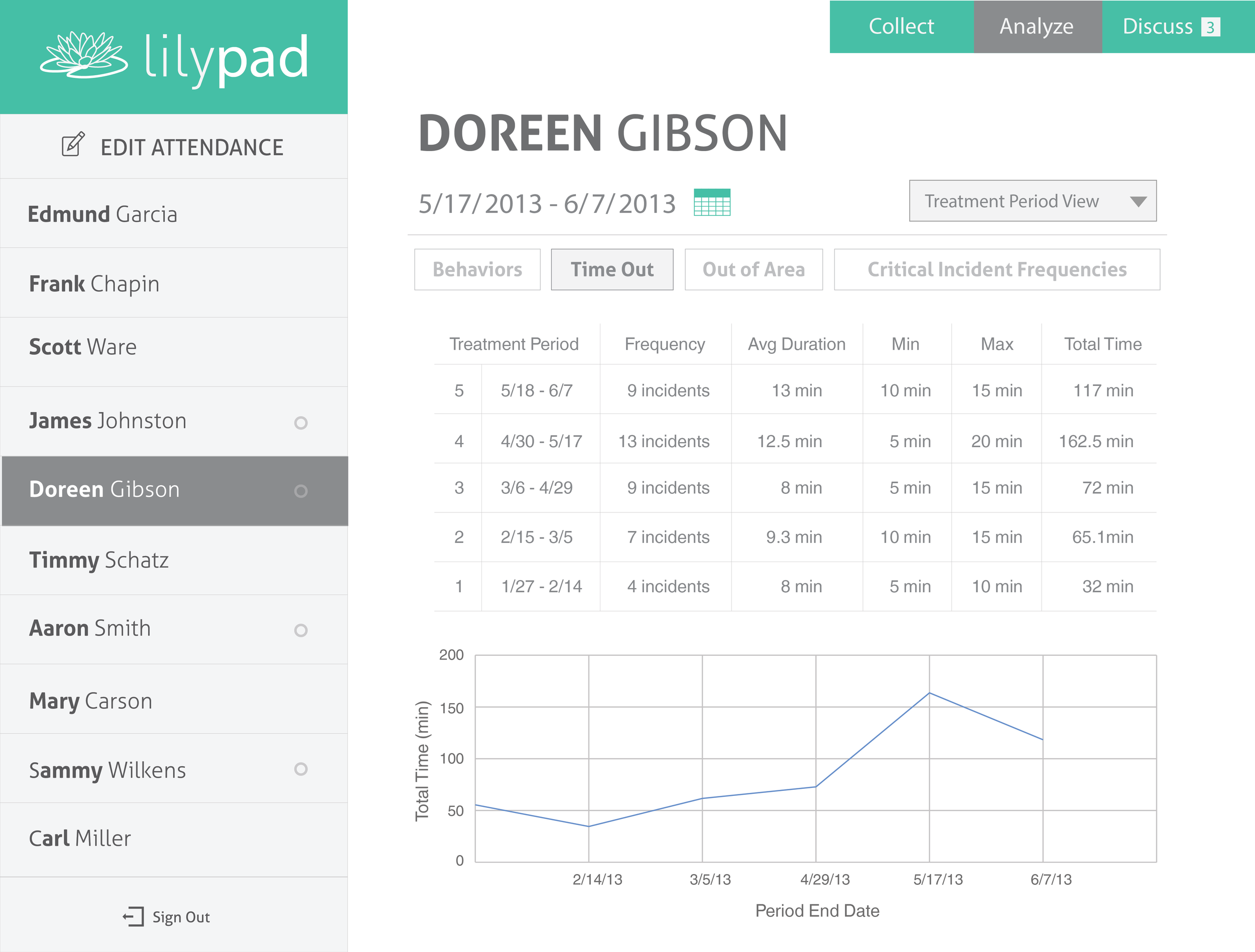
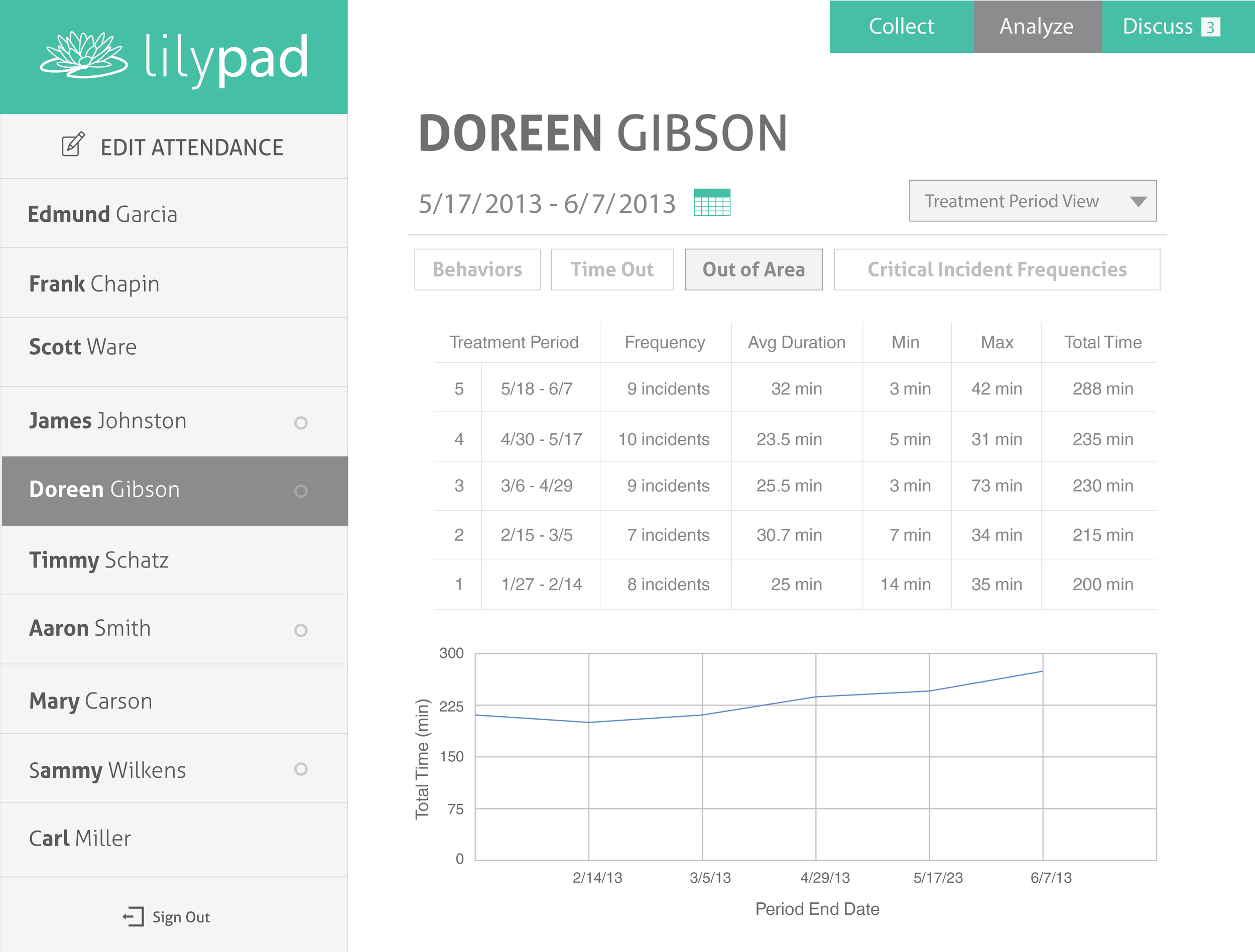
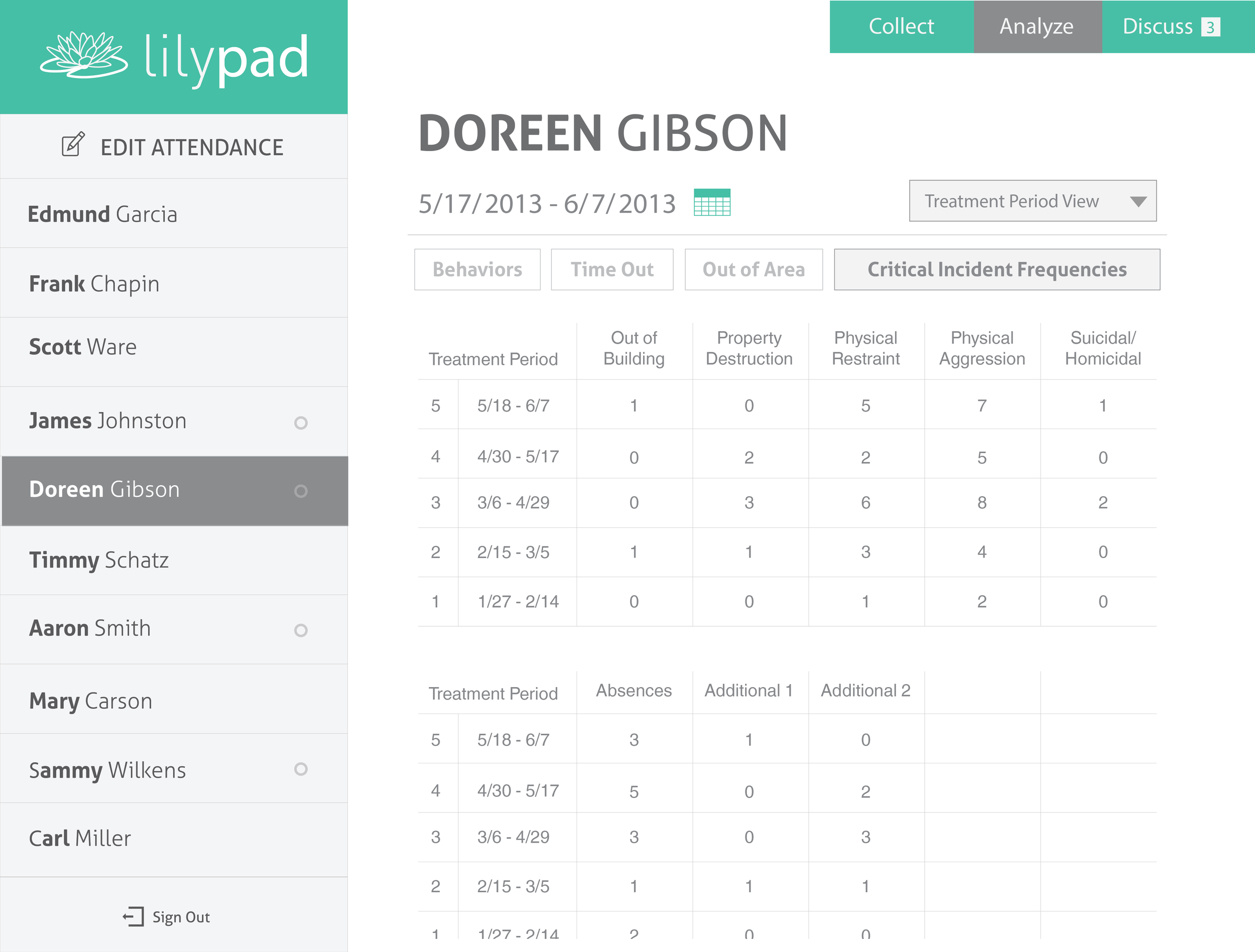
Through multiple discussions with various faculty at the school and breaking down the existing Treatment Review Meeting form, I designed the Treatment Period Report page for Lilypad. The video above is a mockup of the Treatment Period Report. The images below are high fidelity mockups of the page in the video.
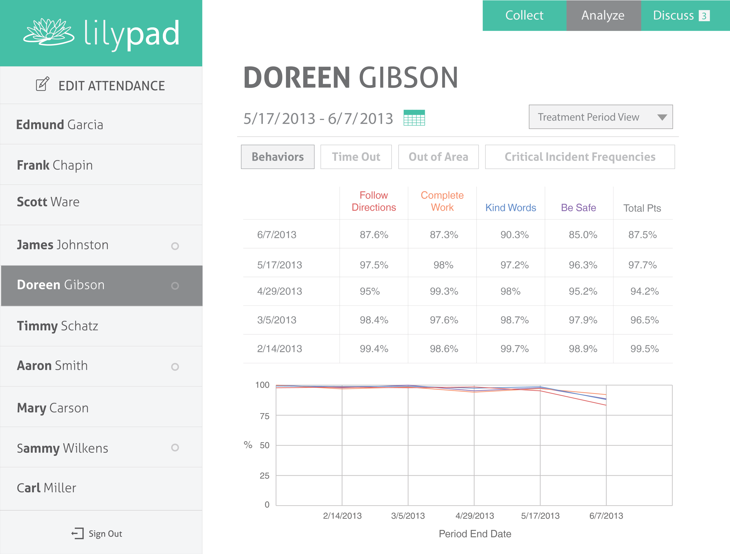
Misc Pages
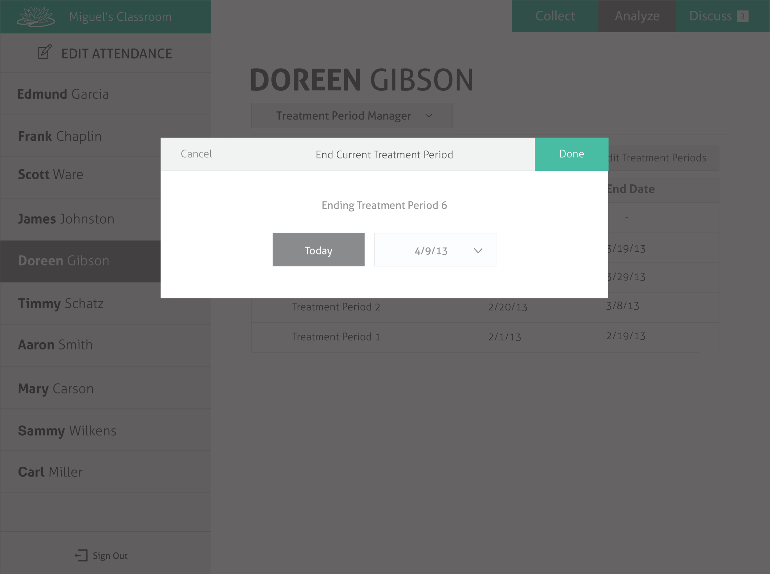
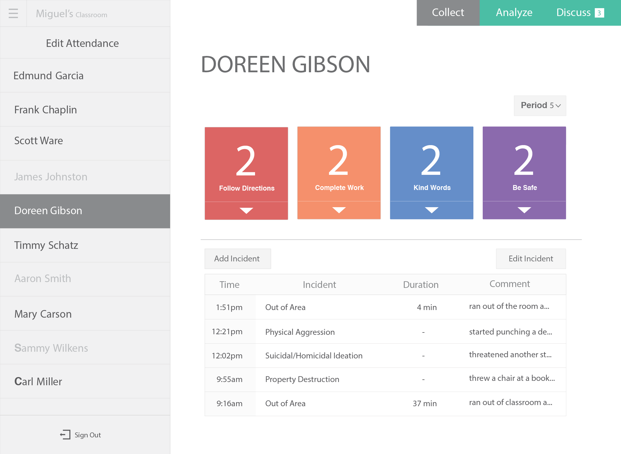
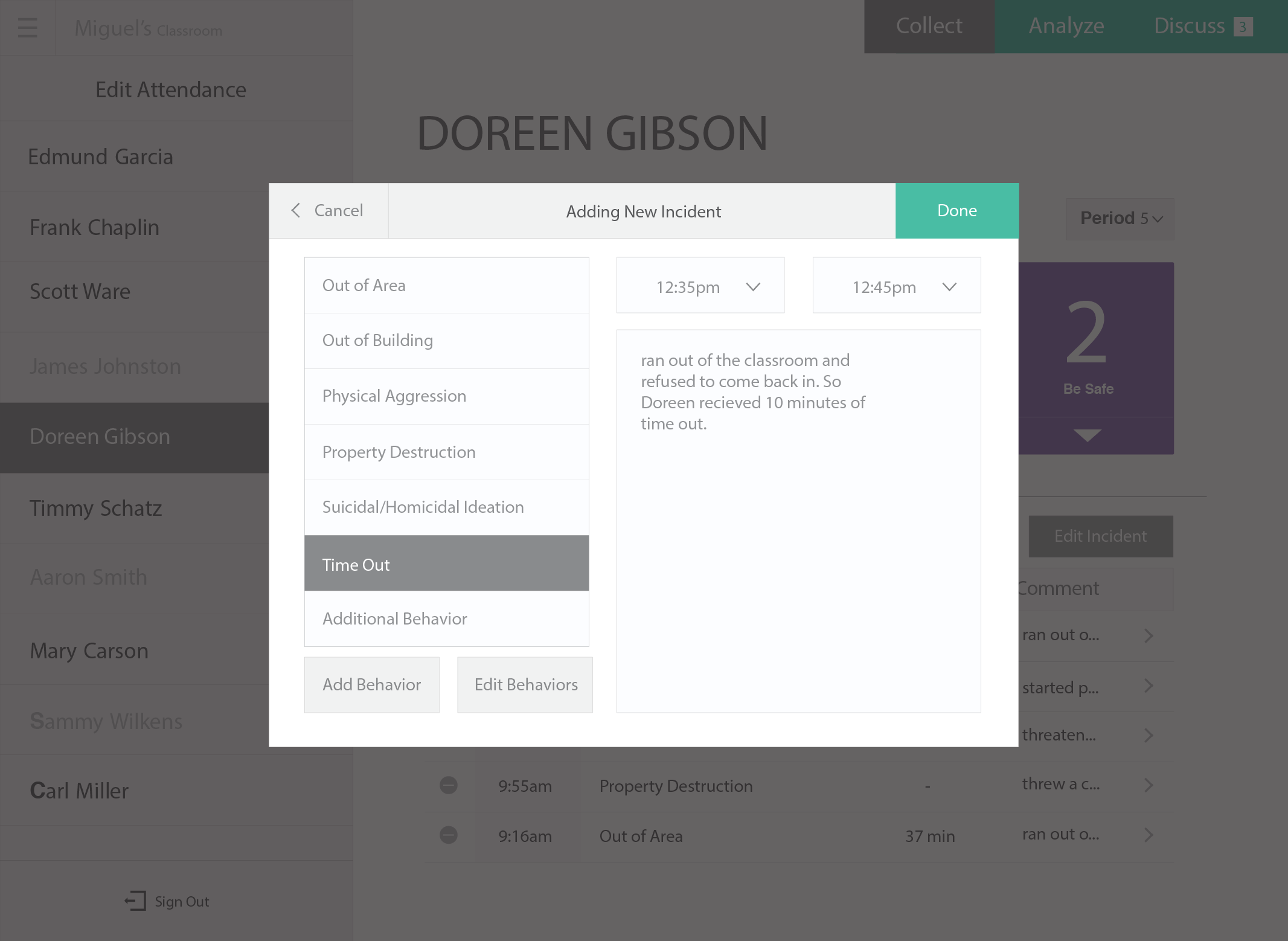
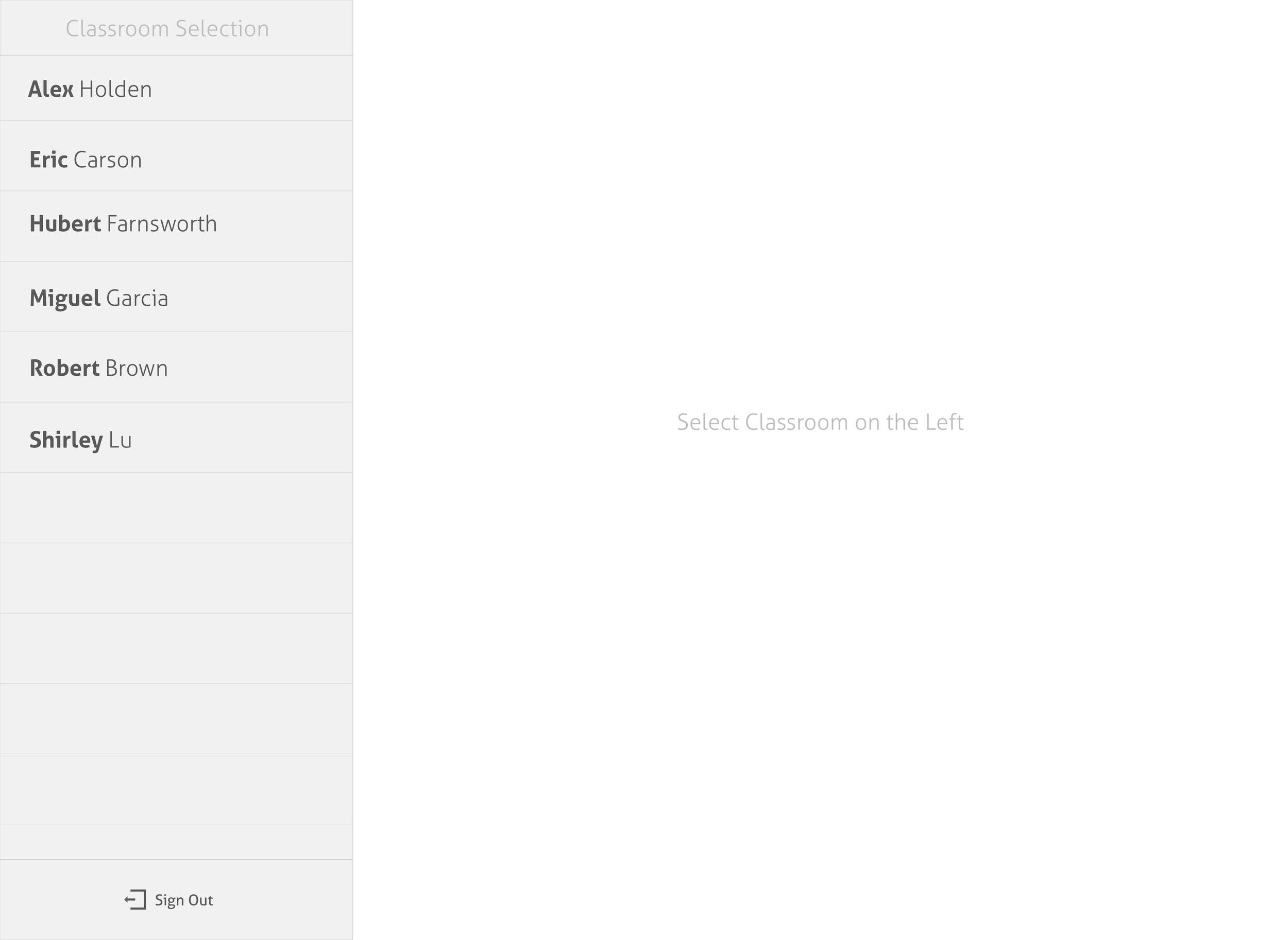
Below is a collection of miscellaneous pages and design elements I worked on. Being on a team with two other designers, figuring out who was working on which parts of certain pages was difficult at first, but we all learned how to effectively work together through the process.
Live App
Below is a screen recording of the prototype app in action. The main purpose of this web app was to be a proof of concept and gather initial data for the PhD research project. Working in a tight timeframe, we rolled out a minimal version of the app as soon as possible to allow teachers to get the app in their hands and start collecting data. As they started using the collect features, we were working with the development team to get feedback, tweak designs, and build the Analyze tab.
Reception
The initial rollout to select classrooms was well received by the teachers using Lilypad. The more they used Lilypad the more excited they got. Even the teachers who were initially sceptical started talking about the potential of Lilypad to improve their ability to perform their jobs.
Development on Lilypad is being continued by Gabriela Marcu.
